“Star”
The new logo design uses a “star” instead of a “line” to differentiate service levels based on the color of the “star”.
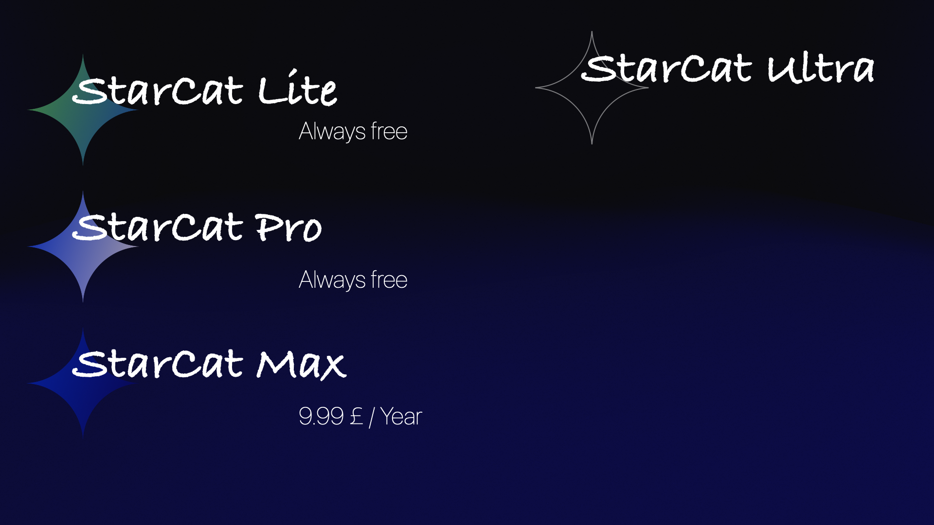
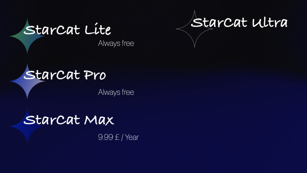
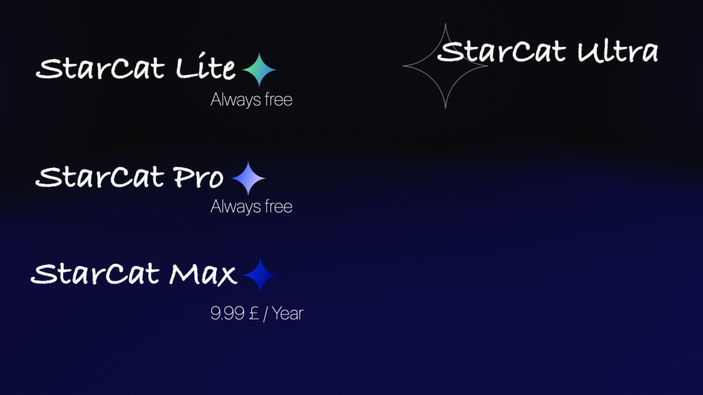
Lite
Represents vitality and lightness, using bright colors and highly saturated gradient color schemes
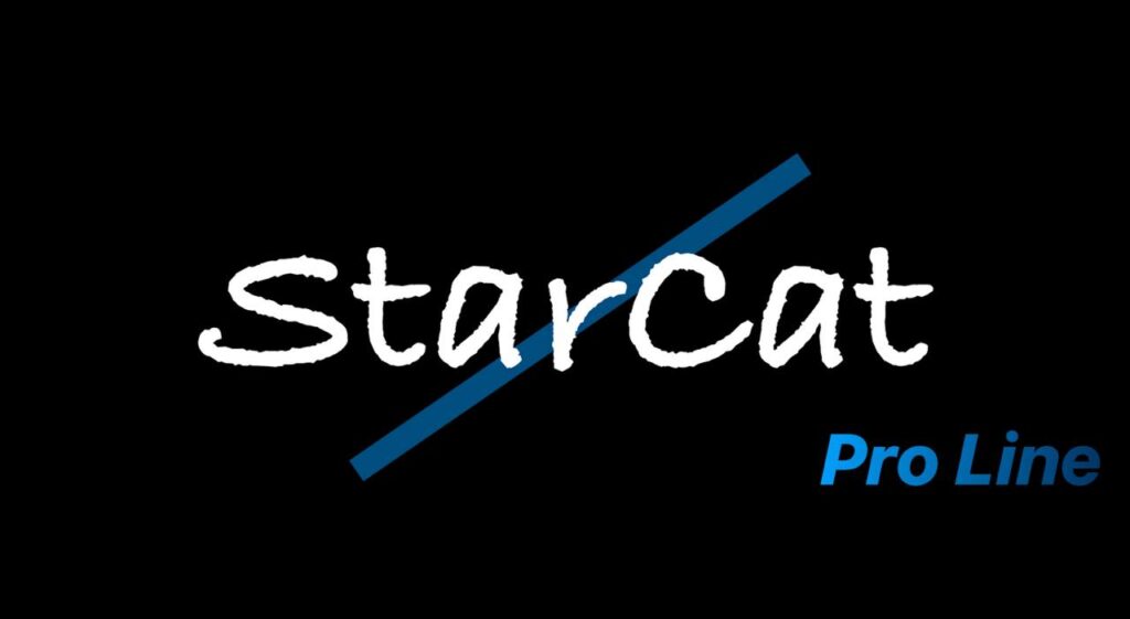
Pro
The color scheme for Pro and Max uses the “Star series”, incorporating elements of the starry sky and the galaxy, with “stable” and “trustworthy” tones as the main colors. Pro, as the entry-level line of the “Star series”, uses saturated blue and deep blue-white colors
Max
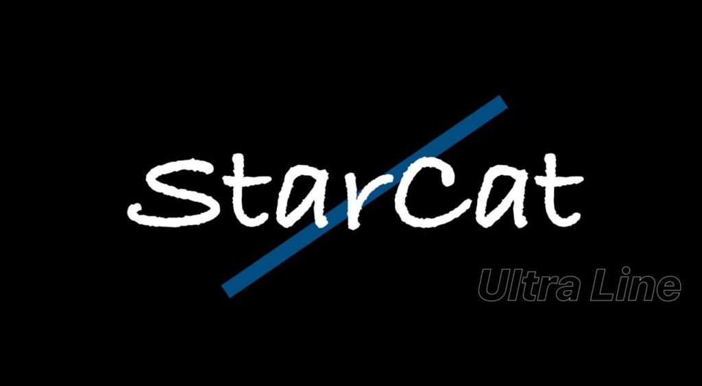
Formerly known as the “Ultra line”, it also uses the “Star series” color scheme. As the highest level of StarCat’s public welfare service, Max uses deeper colors compared to Pro
Ultra
StarCat’s public service line. The color of the “star” uses a transparent fill, relying on the outline to show the contour of the “star”, indicating “All”. The “star” can be any color, showcasing the significance of Ultra as StarCat’s highest-level service
StarCat and Humanism
StarCat’s design revolves around “humanism”. Whether it is the selection of avatars for channels, groups, or bots, or even the names of the bots, my original intention is to let everyone feel the vitality of “people” rather than the rigidity of “machines”. The use of avatars depicting real people instead of logos for channels, bots, and bot names reflects this idea. Although there are no “people” in the logo design, the vibrant color scheme and the less rigid handwritten font still allow everyone to feel the sense of “humanism”. If you are a friend who is more active in the group, you may have noticed that I don’t like to refer to group members as “users”, but rather use more intimate terms. We are not just in a user-merchant relationship, but friends.
Furthermore, all the announcements published in this channel to date, or the articles published on the wiki, are written by me personally, rather than being “cyber garbage” filled with a uniform template flavor generated by AI. Doing so also represents my “dedication” to StarCat.
StarCat Old Logo Design
Attached are the old StarCat logo designs.
Figure 1 serves as the representative image for StarCat’s high-end lines, using black and blue colors to emphasize “reliability” and “stability”. The casual handwritten font makes the entire logo look less “rigid”.
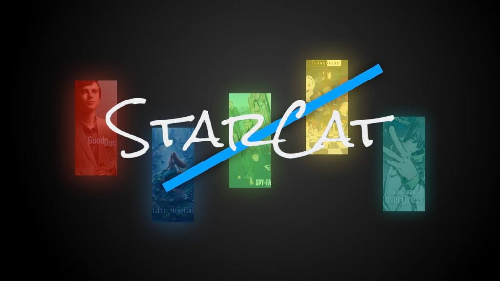
Figure 2 is the latest logo for StarCat’s public service line, using a movie poster as the background, paired with a rainbow color scheme, making it look more “vibrant”.
Attached are 3 line designs.
The “star” design for Ultra inherits the hollow outline design from the “line” design. In the “line” design, Plex uses a similar design approach to Ultra, adding a glow to the edges to indicate that Plex is an independent service line. Pro still uses blue as the main color scheme. The difference is that in the “star” design, Pro’s color scheme is more “vibrant”.
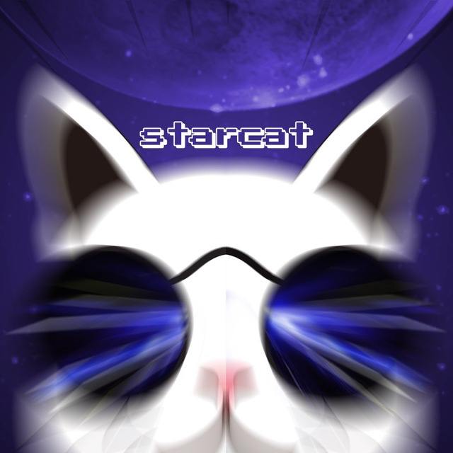
Attached is the honorary chat group avatar designed by @GiNi_BaBa Using stars and cats as the primary elements, the design aims to highlight the main theme of the StarCat name. By employing “motion blur”, the entire header image, even as a static picture, appears to have “life”.
發佈留言